Effective financial ratios can give your church vital insight into your financial condition and trends. But once you’ve gathered all the data necessary to prepare a ratio analysis and complete your reports, what’s the next step? This article explains how to analyze this information to get the most out of it.
Let’s start with a look at some sample ratios from the CapinCrouse Church Financial Health IndexTM (called the Index in this article). The report examples below use a three-year data trend, but the Index reports allow for a five-year trend which may be even more beneficial for your church’s analysis.
The Index also allows you to sort peer churches by whether they are a single or multi-campus church, which helps in comparing to similar peers. The example below is a multi-campus church.
Demographics
It’s useful to start with a detailed review of the demographics of your church. Demographics are the data relating to a population and particular groups within it. For a church, this can include data such as the size of the church’s attendee base, the number of attendees at each location, and the amount of contributions without donor restrictions, to name a few:

As you can see in this example, the demographics can consist of either financial or non-financial data. It’s important to look at both. When you understand the composition of your peers, you’ll understand why it’s important (or not) if your results are similar or different.
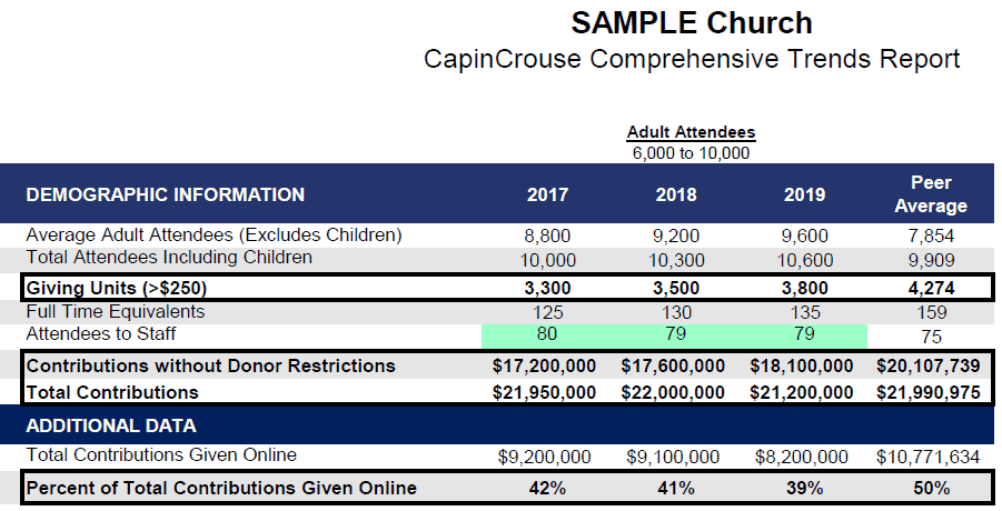
It’s helpful to start with contributions because they are so critical to the operations of the church. Our sample demographics section has the following information related to contributions:
A giving unit is a regular recurring supporter who gives $250 or more a year to the church. This supporter may be an individual, husband and wife, or group of family members who contribute jointly to the church.
From this data, we can draw several conclusions about the church and its peers. The giving units, contributions, and percent of total contributions given online are all below peers. We also see the trends between years, which tell us that giving units and contributions without donor restrictions are increasing. However, total contributions are both up and down, with no consistent trend, and total contributions given online are decreasing.
Each demographic is important but when combined, they begin to tell a story. It could be that this church needs more emphasis on online giving, which helps donors stay consistent in their giving. While the church is likely teaching attendees to practice giving, there is still room for growth in this area.
Take Demographics to the Next Level
Now that we’ve discussed the basic analysis of contribution demographics, let’s look at how to get even more information out of that data.
You can calculate what percentage some demographics are of others. Then compare this between your church and its peers. For example, what percentage of giving units does your average adult attendees number comprise? How does that compare?
Here’s an example:
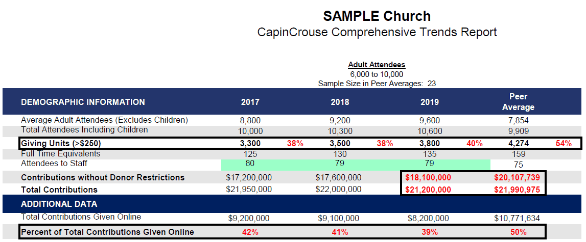
What is the benefit of knowing this? The additional analysis tells you the rate at which your average adult attendees — who may or may not be recurring supporters — are converting to giving units and how that compares to your peers.
Based on this additional analysis, the church in the example above is converting fewer attendees to giving units than its peers. Combine this with the fact the church is providing attendees less opportunity to give online and it may explain why overall contributions are lower than peers. This information could be very valuable to church leadership.
We also recommend that your church monitor both the number of new and lost giving units. This will provide additional trend analysis.
Correlation with Other Revenue Measurements
Other revenue measurements can uncover additional insight into your church’s giving habits. Here’s another example from the Index:
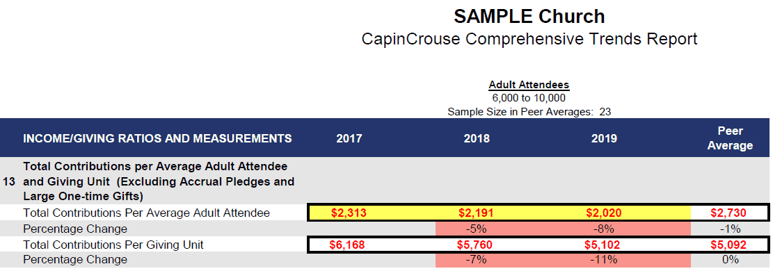
In this example, the average adult attendee is giving less than those at peer churches but the average giving unit is giving slightly more. So what does this indicate?
The data shows that when this church converts an attendee to a giving unit, they typically give more than peers. However, from the demographics ratios, we know that the church’s conversion rate is lower than peers. That indicates an area the church can focus on to increase overall giving.
This measure also shows a trend of contribution amounts decreasing between years. This is partially attributable to the fact that total contributions have decreased. But this measure is also affected by changes in adult attendees and giving units.
Both of these factors are increasing between years, which will negatively impact these measurements because they are both the denominator in the calculation. When the denominator increases, the final result is smaller. So part of that decrease is due to the increasing number of average adult attendees and giving units. If these non-financial data points were staying the same or decreasing, this trend would be more of a concern.
It’s also useful to review median household income given to the church:
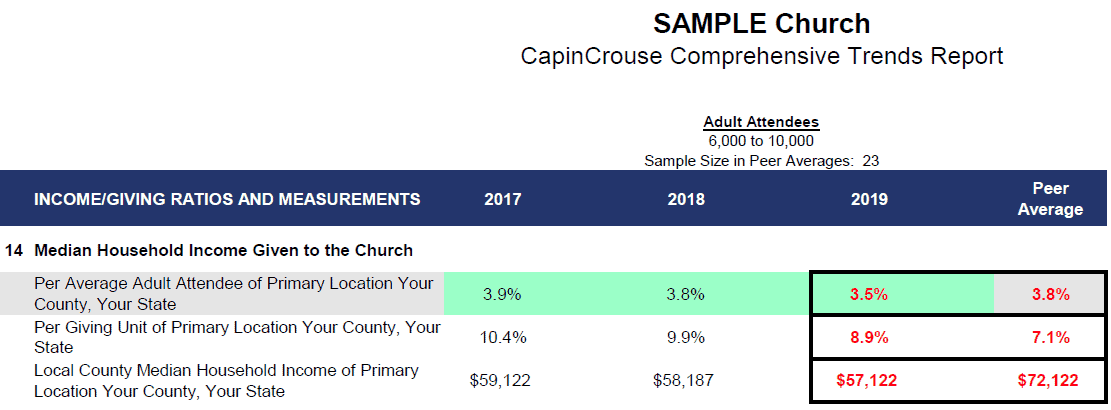
This contribution-related measure provides information about the attendees and giving units, and the resources they have available to contribute. Specifically, it tells how much of their income (by local county or metropolitan statistical area) attendees and giving units are contributing. It lets the church know how much more giving capacity the congregation has, if any. But it also tells the church how the income in its area compares to peers and if it’s increasing or decreasing between years.
In these sample ratios, you can see that average adult attendees are giving slightly less of their income than peers while giving units are giving a greater percentage and are very close to a tithe. This is true even though the local median household income is about $15,000 below peers. This means that when this church converts an attendee to a giving unit, they will give more of their income than peers.
The data also shows that the local median household income has gone down in each of the last three years, which may further explain the slight decrease in contributions per attendee and giving unit during that time.
Correlation with Opposite Ratios in the Analysis
Now let’s take a different approach and compare total contributions per average adult attendee and giving unit to the financial cost by each, as follows:
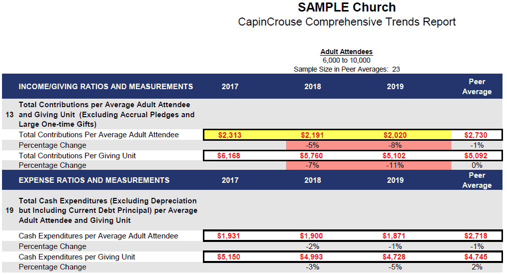
A quick comparison tells us that the net position of total contributions received and financial cost per average adult attendee and giving unit is high enough to cover the cash cost of everyone walking in the door. It also tells us this is consistent with peers. If it wasn’t, the church would need to look at whether the results of its general operations were positive or negative.
Sometimes a church has other revenue sources that are not reflected in this measurement so while the net position (based on giving alone) is negative, the result of overall operations is positive. There also may be years when a church deliberately chooses to make investments in its ministries that result in a negative change in operations.
The key is the trend of this result from year to year. In our example, the net position for these measures is positive for the last three years, so we know this church can fund cash operations through current contributions received.
Putting all these analytics together can provide a comprehensive analysis of your church’s giving habits. And that can be very valuable to your church leadership.
If you want to benchmark your church but are unsure where to start, ask us about the CapinCrouse Church Financial Health Index. This convenient online tool is designed to help churches measure and analyze their financial strengths, weaknesses, and trends to see where they have been and map the best route forward.


